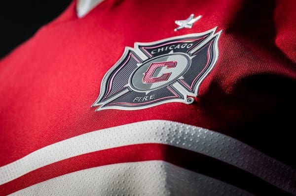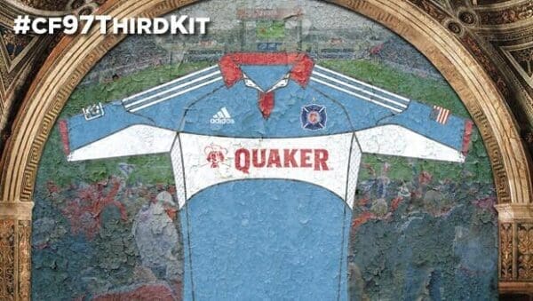
Oh my beloved Chicago Fire… Chicago’s once-great soccer team the Fire today have unveiled their primary jersey for the upcoming 2016 season. The design is, again, underwhelming; it looks more like a training kit than anything else. While it was good to see the team’s “Home” shirt is bringing back the white bar across the chest, it sure isn’t cool to see new sponsor Valspar fill that spot as opposed to how “Fire” was emblazoned in the club’s early years. Look, I get it with the Valspar, but it doesn’t look cool on the shirt.
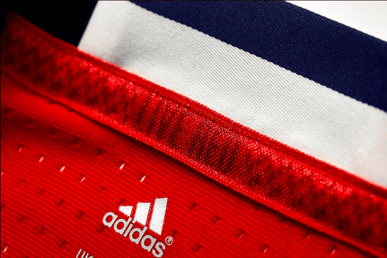
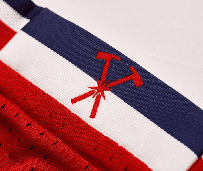
The saving points are the small details on the kit, including the words “Live Red” on the inside of the shirt collar, an embossed City of Chicago municipal flag, and the crossing fireman’s axes. Those original, custom-designed features are a cool addition, but they don’t save it. Somehow, even with the complaints, it’s somehow better than last year’s…
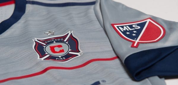
Adidas, please have something special cooked up for the secondary kit… See more shots of the shirt below.
[facebook id=”10154036186059789″]

